10 Design trends for 2022
Goodbye 2021, hello 2022, a year we hope is full of positivity. The design world looks primed to reflect this with nostalgic and bold creative to inspire comfort and happiness. These are the 10 design trends you need to know in 2022.
90S NOSTALGIA
This trend will look back at the ‘MTV 90s’ design style, colours and patterns. Even technological limitations are being embraced, with low-fi 90s UI. This call back to the dial up days will create a similar playful and nostalgic vibe that captured the 80s through films like Drive and Netflix’s Stranger Things.
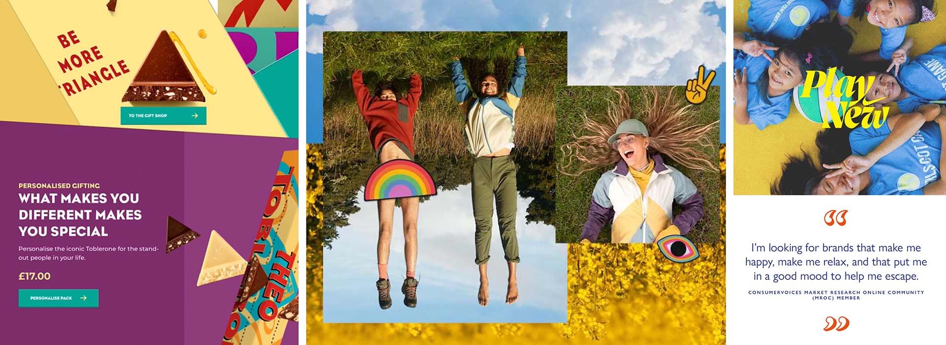
HAPPINESS FIRST
There’s nothing like the events of the past few years to inspire a shift in priorities. Now, happiness has taken a front seat over the ‘bigger is better’ mindset popularised in the preceding years.
This more content outlook will come alive through a happier, sillier and more positive tone of voice in 2022.
FLUID TYPE
We’ve already seen a move towards increasingly expressive, flowing, playful and vibrant
typefaces. As brands become more global, how words ‘feel’ is becoming as important as what they say. This is one trend that’s certain to grow over the next number of years.
FONTS WITH A TWIST
Typefaces with mixed weights, widths and overall styles will continue to be a way in which brands can engage and create a reaction in a ‘scroll society’.
MAXIMALISM
This illustration style isn’t just filling the space, it’s a playground for colour, detail and energy to run freely.
It’s possible this style is inspired by the restricted nature of the past two years, a post lock-down explosion of expression, something which is mirrored beyond the design community.
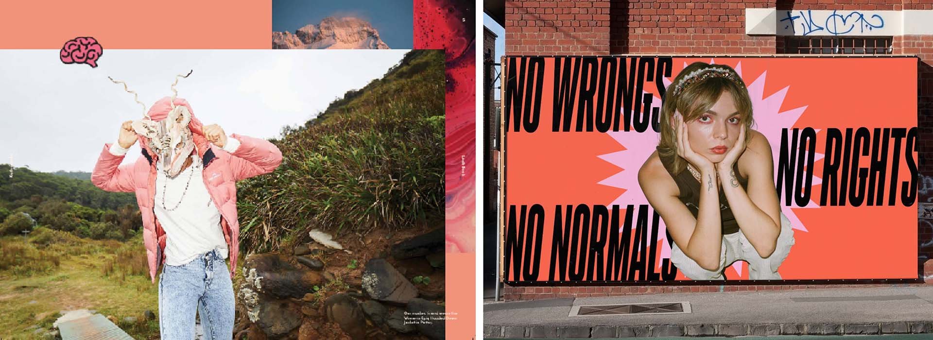
ANTI-DESIGN
A move towards jarring collage, sharp contrasts, powerful neon, and irregular frames is one way brands will attempt to cut through the noise.
This trend has been used for some time but in 2022 will be embraced by more mainstream companies. This can be seen in the Kathmandu rebrand that burst onto the scene in late 2021.
2D MEETS 3D
Animation and illustration that blends the line between 2D and 3D to create fun clashes to worlds. This mix of two opposing styles has real cut-through and it’ll be interesting to see which brands embrace this as a visual communication medium in the next few years.
RISOPRINT
Another fantastic example of a shift towards a simpler design aesthetic. The past two years have changed the way people view the world and what is important to them. Simple things have been shown to be of greater significance than the shiny new thing. This is being reflected in design trends.
RESPONSIVE LOGOS
The word used to be ‘make the logo bigger’ and now it might change to ‘never lose the logo’. Content is now viewed on such a range of devices and screen sizes that having a logo that can adapt is a great way to make it work harder.
BRANDS IN MOTION
This is a continuation of an existing trend but will remain a focus for brand creation moving forwards. How a logo animates and a brand uses movement has become increasingly important in outlining the personality of a brand and creating engaging content. With more digital touch points than ever, motion has become essential.


