Spark UK Rebrand
Beyond a rebrand; a beacon of hope, sparking conversations that matter
When Spark UK came to us, they carried a heavy ambition in a light-hearted package. They wanted to be seen, truly seen, by the young souls they aim to inspire. Our mission? To transform their brand into a beacon that not only stands out but speaks out about the mental health challenges today’s youth face.
Client
Spark UK
Sector
Non-profit
Location
UK
We partnered on
Brand strategy
Logo design
Design kit of parts
Illustrations
The brief
Spark UK asked for a mirror to reflect their evolved identity—bold, trustworthy, yet relatable across generations from teens to teachers. They wanted a brand that’s not just seen as a logo but felt as a movement.
The Strategy
The strategy was simple: listen, understand, create. We listened to the voices of those who lived the brand—students, founders, educators. We dove into the world of a charity born from a teenager’s vision to shift the conversation on mental health post-Covid. From a spirited discussion to an award-winning entity, Spark UK’s ethos was clear—sparking conversations around mental health.
The Design Magic
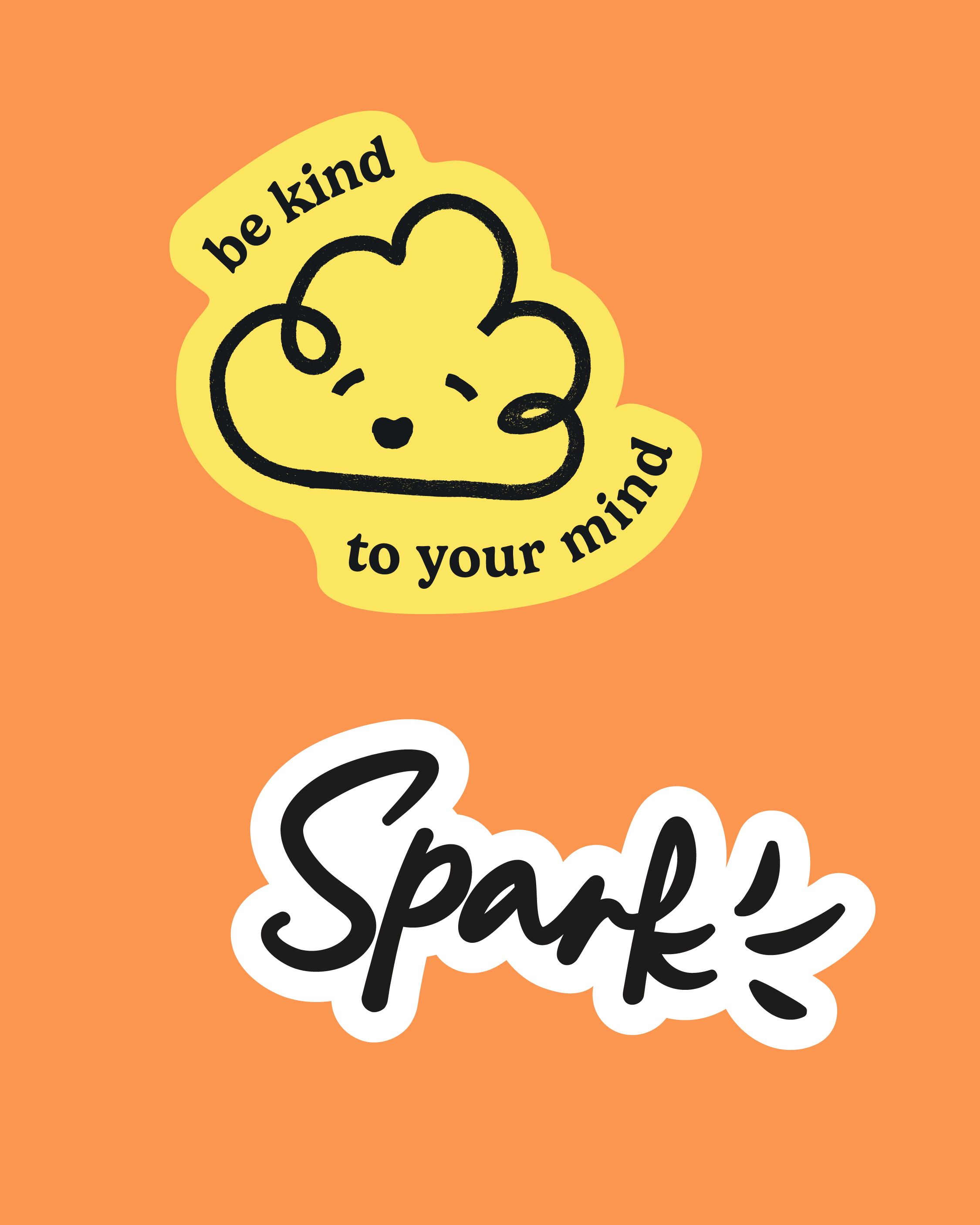
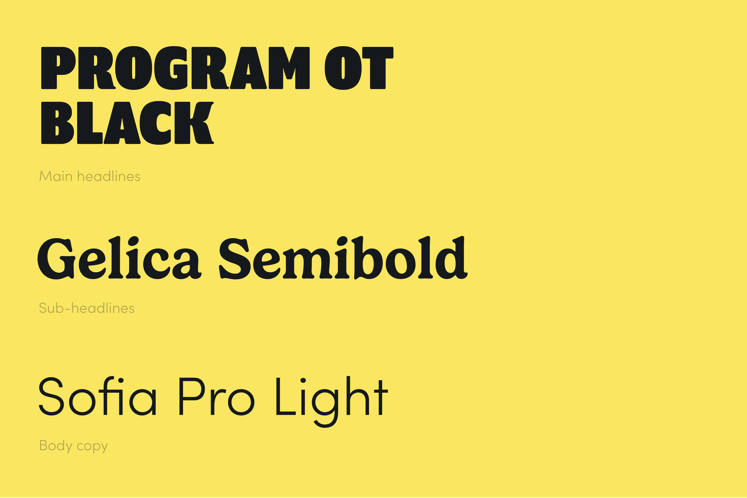
We kept the soul but changed the packaging. The logo, dynamic and drawn with a young hand, captures the essence of conversation—the ‘k’ laughs, cries, shouts in its lines. We chose a palette that speaks with vibrance yet comforts with warmth. The typefaces walk the fine line between professional and playful, ensuring clarity in every message.
The Results
The rebrand didn’t just change the logo; it sparked a movement, a catalyst for change and a beacon for hope. Ready for the next awe-inspiring chapter. Spark UK now carries a brand that’s as alive and vocal as the conversations it starts. It’s not just seen; it’s heard, it’s felt, it resonates. Each element of the brand toolkit works seamlessly across platforms, bringing consistency to their message and continuity to their mission.
“We loved working with Judy and the Tickety Boo Creative team for our Spark UK Rebrand. They made the process easy and enjoyable by being attentive to our needs and patient with our requests. Creating a branding that encompassed our goals and youth voice whilst remaining professional and uniform, bringing together a concept that showcased our progression from ‘passion project to full-time organisation’. We hope to work with them again and couldn’t recommend enough.”


