Branding: it’s all in the details
Most brands have a big vision however it’s often the small details that customers remember when they interact with them. From micro design elements to an engaging tone of voice, small details can make a big impact.
WHO GIVES A CRAP?
It’s not just us who love a brand’s attention to detail. The self-described ‘Feel Good Toilet Paper Company’, have a big mission – 50% of their profits go to charity. They’re in a business with no shortage of demand – just look at March 2020, yet it’s the small details that have kept a captive audience beyond a pandemic. We love how each roll of TP is wrapped in fun, reusable prints as part of a no plastic mission. Their copy is fun and playful – ‘Delivered to your door. Well, to your front door, your bathroom would be creepy.’ It’s their love of a cheeky graphic too – ‘Bum Satisfaction Guarantee’ etched around an illustrated bottom is exactly the kind of thing that would be shot down in most boardrooms, but here it just becomes a well-played gamble of their customer’s sensibilities. Lighten up, it’s toilet paper, after all.
I-ROBOT
Founder Jude loves the Pizza Robot from Dominos. Instead of us waiting forlornly by the door, Dominos features a clever robot interface that tells you exactly where your pie is on its journey to your plate. Despite scepticism over its legitimacy (just search ‘Domino’s Pizza Tracker, real or fake?’), there’s no denying that it’s the most engaging way to wait for your next delivery. Is it a bit of futurism fantasy or culinary stalking? It’s a lot of fun any way you slice it.
TICKETY BOO CREATIVE: IN DETAIL
Our award-winning rebrand for Sad Girls Club, is the perfect example of meticulous, cohesive details. It begins with the logo itself, where we embraced the real stories of the women the community represents. The logo is both happy and sad, reflecting the spectrum of complex emotions and silent mental health struggles. We also created a suite of character illustrations, to help give an identity to emotional states like anxiety and frustration and to de-stigmatise them. The characters are quirky, irreverent and bring the whole look and feel together. They really come to life on their new website we built which also features very satisfying button animations (breathe in, breathe out – you’ll see what we mean), animated banners and more.
For Small Business Collaborative, it was about capturing the owner/founder’s quietly confident, and nurturing personality. The connection of the ll’s symbolising the helping hand she gives to her clients – the collaboration and connection between businesses.
As a pan-Asian business with an impressive portfolio of brands (including 7-Eleven, IKEA, Mercato, and GIANT), the DFI brand needed to represent a diverse roster of businesses. For their new logo, the ‘I’ purposely has slightly less prominence to give more focus on ‘DF’, referring to the original Dairy Farm namesake. Meanwhile, the group of dots which make up the ‘I’ create the community of brands coming together.
HONOURABLE MENTIONS
Junior Designer, Chloe, loves Surreal. “The brand is made for people who are health conscious but giving it a playful edge throughout the branding, packaging etc, showing that healthy food brands don't need to be so serious and boring! It has a modern yet disruptive tone of voice too which I like.”
Design Director, Paul, is a fan of Biercompany. “There’s a really nice tone to language and illustration. From web to delivery everything is consistent and fun. The beer selection is very good which helps the whole experience live up to the promise.”
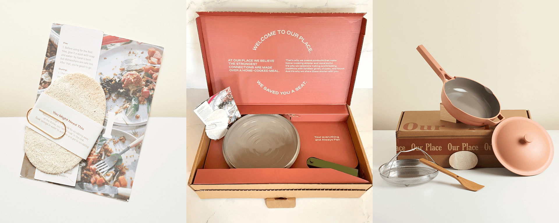
Senior Designer, Lou, has an appreciation for Our Place and their packaging that consistently surprises and delights. “I really like the attention to detail on the packaging messaging. It’s a premium product with an inclusive and welcoming vibe that really shines across all touch points.”
Have these little details captured your imagination? Which brands do you love to take a closer look at? We’d love hear your thoughts – share with us @weareticketyboo on Instagram and Twitter.


